Tuesday, 26 January 2010

Final Print Product - Back Cover (Whole Group)

Before...
After...
This image was shot in corporation park. As it was a winter image the colour of the grass and trees is very washed out and there is not much colour in the image. We were aiming for a much more brighter and autumn style look for our back cover.
A seperate 'overlay' layer was added and paint brush was used to add a brighter blue colour to the sky. The path in between the trees was selected using the 'lasso select' tool and the brightness of this was altered so the colour was brighter. The edges of the path were blurred out using 'fragment blur' so that they blend into the sides of the grass.
The next step was to add colour to the trees and the grass. This was also done in a seperate overlay layer. The paintbrush tool was used to add a bright green colour to the grass and different autumn orange and red shades to the top of trees. Sections of these were blurred out so that the colour looks natural. It took some time to achieve the result as the trees and grass had to look natural and blend in with the rest of the image.
The final part of this was to add the text and barcode which was very simple. We used the same font that was used on our front cover to keep the theme consistant.

Final Print Product - Front Cover (Whole Group)

Before...
After... 

This image was shot editing for our front cover and was worked on as a group. This image needed a lot of work as not only were the colours dull and gloomy but we also wanted to show a silhouette holding a balloon. We did not have access to a helium baloon therefore it was very difficult to take and original image of someone holding a baloon.
We began by editing altering the brightness and contrast of the image so that we could edit the snow. The snow was painted over using different whites and off white shades to mnake the snow even and erase all the footsteps that are in the original image. We blurred out the section using gaussian blur so that the snow looks flawless.
In a seperate layer we then added an image of the sky that we took an positioned this to look as if that sky was behind the trees. This was done as an 'overlay' so that the sky blends into the image. The brightness and contrast of this was also edited so the sun in the sky was glowing.
After this the trees and the sihlouette were selected using the magic wand and the contast was altered to make them darker for them to look like silhouettes against the sky.
The balloon was a cut and pasted from a seperate image that we pasted into a seperate layer to make it look like as if the balloon was in the actual image. As you may have noticed in the original image the person is actually holding the balloon in their hand. Therefore we erased the balloon from the image and pasted one from a seperate image. We altered the colour and brightness of this and changed the colour to a brighter blue in order for it to stand out from the rest of the image. We then added  thin line for it to look like a string attached to the balloon.
Finally the text was added to complete the front cover.

Sunday, 24 January 2010

Album Advert in Magazine

We will be working on our advert together as a group.

For our magazine advert we will be using an image of the artist (Conor) in the background, with the leaf affect background in order to keep a consistent theme through our products. At the top we will have the name of the artist and the album cover in the same font as used in our Digipak (matchbook). We will also have images of the front cover of our album along the left hand side of the page. At the bottom of the page will be ratings that magazines have given the album.

This is our basic initial idea of our album advert.

Update

We have been editing our music video and have found that some of the shots are very weak and not effective due to the bad lighting. As a group we felt dissapointed with our music video and therefore decided to go out and film some more new footage outdoors with better lighting and better angles. We are hoping to change what we have produced so far and add the new footage to our music video. We hope the new footage that we have shot at the castle and the park will look much more effective in our video.

Saturday, 23 January 2010

Feedback

Lots of good research here. Just make sure you put a post somewhere analysisng how ads for albums work and a plan for yours.

At some point can you identify who is creating what panel and what image you want your cover to convey to people?

Things are shaping up nicely - so keep being creative and exploiting the resources the DTP and editing packages offer you!

Mrs Doggart

Wednesday, 20 January 2010

Ancillary Task Research - Existing Six-Fold Digipak Analysis.

Whilst planning the creation of our six-fold digipak, we thought it essential to briefly evaluate an existing six-fold digipak of the same genre, to establish the key conventions we will need to use. Therefore we have looked at the album ‘Lungs’ by ‘Florence And The Machine’. It was produced by Paul Epworth, James Ford and Steve Mackey and the standard edition of the album was released on the 6th July 2009. The deluxe six-fold edition we will be looking at was also released on the same date, but is a double CD featuring new demos and percussion versions of previous songs.


Here is a break-down of each album sleeve at different intervals of folding:


The front cover:
 The back cover:


The first two slides once the album has been opened:


The three slides inside once the album has been completely folded out:


The three slides on the outside of the album cover once it has been completely folded out:


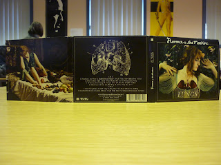
If we begin looking at the amount of detail put into each sleeve fold, we can see just how important cover art, and indeed sleeve art, is to the overall product. Each fold is almost like a piece of art, whether it be photography or a painting and each linking to the theme of the album. For example, the sleeve art and CD art of the centre inside fold is an edited image of Florence Welch holding a rabbit, thus linking to her song ‘Rabbit Heart (Raise It Up)’.  The title is also hugely linked to the art used, the front and back cover highlight this especially. By looking at the front cover, the mise en scene portrays Florence wearing a piece of jewellery shaped as lungs made out of wood, this is then complimented by an intricate yet scientific drawing of lungs on the back cover, just above the album track listings. The editing of this main image has highlighted on particular colours, such as her hair and the flowers around her, almost bringing the image to life.

Focusing more now on the way the tracks are indeed listed, we can see they are listed horizontally, almost like one long sentence following onto the next line. There are thirteen tracks on CD1, following with 7 bonus tracks on CD2. By looking at the image of the lungs previously mentioned, there are numbers relating to the songs placed at various places around the image, almost anatomically. Aside from the barcode, on the back cover are also instructions on how to unlock bonus tracks, and a website ‘www.florenceandthemachine.net’ where you can find more information about the artist herself. This writing is written in an intricate looking font, almost calligraphy which is also used on the front cover but in a much bolder style. These two sleeve folds are the only ones with any writing at all on them, and what writing there is, is minimal. On the sleeves that hold the two CDs, the backgrounds are the same as the images behind Florence herself on the front cover, the remaining sleeves are all photography or paintings. Although this is not necessarily needed as a part of our final product, Florence’s album contains a small pocket underneath the first inside cover art. In this pocket is a small booklet, in which there is information, lyrics and other images Florence herself has picked out.

The second part of our ancillary task is to produce a magazine poster advert for the album we have created. We will look at this in much more detail further on in our research, but briefly, in relation to ‘Lungs’, here is an example of the advert. This one itself was also featured in magazines, although here it is on a billboard, featuring the cover image, the name and the release date:

Tuesday, 19 January 2010

Digipak ideas


These are the ideas we have put together for our 6 panel digipak. The image on the bottom right will be our front cover. The image on the top left is our back cover. We will be working on these and editing these as a group. The other four panels each one of us have designed as individuals and will be editing them as individuals. The other two panels that have not been drawn will be an image of the artist and a forest trees image.
The concept of our digipak is based on the idea of different seasons and weathers as that is the name of the album and is also the name of the song we have created a music video for. Therefore a front and back cover will have the contrast of both autumn and winter. As we have been creating our project in winter is is very hard to get still shots of images where we can make it look like summer as the weather is really bad. Our album has the same theme as our music video as our music video has shots outdoor and in the snow. So we have aimed to keep a consistant theme.
The image we want to convey through our album art is to show uniqueness and creativity. We not only want to portray the artist as being creative but also his music providing various connotations. For example the album itself creates a certain nature theme which is in order to represent the artist as being one of a kind and distinctive to others.
At this stage we have already started editing our panels and are half way through our editing. Once all the editing has been done we will be uploaded before and after images and breifly explaining how we got the final result and why we thought this would be effective.


Who is doing which panel :-
Digipak front cover - Full Group
Digipak back cover - Full group (Autumn Trees on either side)
Digipak panel 3 editing- Jess (Image of the Artist Conor)
Digipak panel 4 editing - Zulaikha (Artist and Jess holding hands walking in the snow, with their footsteps behind)
Digipak panel 5 editing- Matt (guitar with leaf background
Digipak panal 6 editing- Carla (Forest Trees)