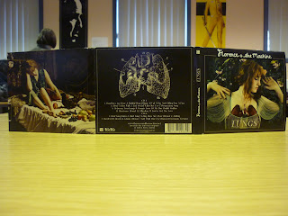
Whilst planning the creation of our six-fold digipak, we thought it essential to briefly evaluate an existing six-fold digipak of the same genre, to establish the key conventions we will need to use. Therefore we have looked at the album ‘Lungs’ by ‘Florence And The Machine’. It was produced by Paul Epworth, James Ford and Steve Mackey and the standard edition of the album was released on the 6th July 2009. The deluxe six-fold edition we will be looking at was also released on the same date, but is a double CD featuring new demos and percussion versions of previous songs.
Here is a break-down of each album sleeve at different intervals of folding:
The front cover:
The back cover:
The first two slides once the album has been opened:
The three slides inside once the album has been completely folded out:
The three slides on the outside of the album cover once it has been completely folded out:
If we begin looking at the amount of detail put into each sleeve fold, we can see just how important cover art, and indeed sleeve art, is to the overall product. Each fold is almost like a piece of art, whether it be photography or a painting and each linking to the theme of the album. For example, the sleeve art and CD art of the centre inside fold is an edited image of Florence Welch holding a rabbit, thus linking to her song ‘Rabbit Heart (Raise It Up)’. The title is also hugely linked to the art used, the front and back cover highlight this especially. By looking at the front cover, the mise en scene portrays Florence wearing a piece of jewellery shaped as lungs made out of wood, this is then complimented by an intricate yet scientific drawing of lungs on the back cover, just above the album track listings. The editing of this main image has highlighted on particular colours, such as her hair and the flowers around her, almost bringing the image to life.
Focusing more now on the way the tracks are indeed listed, we can see they are listed horizontally, almost like one long sentence following onto the next line. There are thirteen tracks on CD1, following with 7 bonus tracks on CD2. By looking at the image of the lungs previously mentioned, there are numbers relating to the songs placed at various places around the image, almost anatomically. Aside from the barcode, on the back cover are also instructions on how to unlock bonus tracks, and a website ‘www.florenceandthemachine.net’ where you can find more information about the artist herself. This writing is written in an intricate looking font, almost calligraphy which is also used on the front cover but in a much bolder style. These two sleeve folds are the only ones with any writing at all on them, and what writing there is, is minimal. On the sleeves that hold the two CDs, the backgrounds are the same as the images behind Florence herself on the front cover, the remaining sleeves are all photography or paintings. Although this is not necessarily needed as a part of our final product, Florence’s album contains a small pocket underneath the first inside cover art. In this pocket is a small booklet, in which there is information, lyrics and other images Florence herself has picked out.
The second part of our ancillary task is to produce a magazine poster advert for the album we have created. We will look at this in much more detail further on in our research, but briefly, in relation to ‘Lungs’, here is an example of the advert. This one itself was also featured in magazines, although here it is on a billboard, featuring the cover image, the name and the release date:


No comments:
Post a Comment