Wednesday, 17 February 2010

Feedback on Products

In order to get feedback from our targeted audiences we used 3 different approaches. Firstly we asked people to watch the video and have a look at the ancillary products in our presence and asked them to fill in a questionaire. We also uploaded the video onto youtube and asked people to comment on what they thought about the video, what elements they liked and what they didnt. The 3rd technique was to email people the link of our blog and a list of questions to answer about our products.
The youtube link is given below in which you can see some of the feedback we have recieved. http://www.youtube.com/watch?v=TXagZHqA2zk
Also some more feedback can be seen in the comment section of our video on our blog.

When collating the results from our feedback we found that we recieved a lot of positive feedback. In terms of the music video a number of those that we questioned felt that it was very similar to other music videos in the way it was edited. As they felt that in a music video the emphasis is greatly on the artists just like we have shown in our music video. Although they felt it was similar to music video they felt that it was slightly different to indie music videos as they are often edited at a very fast pace and consist of very dark lighting however the music video we have created has used much more natural lighting. The audience did however feel that the natural lighting goes well with the lyrics. Audiences also liked the variety of locations used in the sequence as it kept the audience seeing new shots and scenes. Another thing that audiences felt was good was the pace of shots: 'Pace-wise, again, the video fits the style of music, and the content seems appropriately calm and simple'. (audience comment on youtube)

On a more negative note some felt that some of the shots were abit dull and could have been improved with more vibrant colours to represent the love between the couple. It would have more strongly symbolised the couples relationship.

In terms of the ancillary products audiences felt that all the images blended in very well with another and fitted well with the rest of the products. Audiences very much liked the artistic creativity of the album art and the magazine advertisements. They felt that it was something unique and different from other similar products on the market. They felt that it fitted in very well with other indie products as indie art often consists of vibrant imagination and creativity.

However some people did feel it would be appropriate to add one or two more images of the artist as they have not come across the artist before. therefore it would help in promoting the artist and his music.


Below are some of the results we have collected through questionaires about our music video:

1) Do you think the product is typical of a music video? If so in what ways is it similar?

  • Yes because it shows the storyline of the lyrics and also shows the artist playing along with the song.
  • Yeah, the video flows with the song as a romantic love song, and its a romantic video.
  • I think it is typical of a music video, because of the use of imagery and changing settings for the singer to be in in each shot.
  • This is similar to a typical music video because, within the 3-4 minutes, it tells a story to the audience. It does this whilst interweaving between the musicians performing the song and clips of the “story”, this is major stereotype of music videos, and shows that the song is important as it means something to the musicians.
  • Uses similar scenes to what is expected, such as young couple together.
  • The pace of the video and music that is seen in this genre is similar.
  • we see the artist playing his instrument. And in many other videos of this type we see performance shots.
  • Yes, the shots include costuming and set-ups that you would expect to see, such as performing with the instrument and the artist singing. It also follows a storyline which links to the lyrics, which you would expect to see in a typical music video.
2) Does anything make it different or does it stand out from the typical? How?
  • It’s a lot more personal and realistic compared to other music videos.
  • No, i would say it is a typical love video that flows very well with the song and fits together.
  • I’m not sure there is much in the video out of the norm, as I have mentioned the video uses staple techniques of videos in this genre and doesn’t go beyond these techniques, this is also true for the sleeve and poster which use pictures of nature, a common theme in acoustic albums. 
  • Although it does fit in with the stereotypical music video, one feature also stands out, the theme. Just from looking at the video and the album cover, I can tell the theme is weather within rural areas.
  • The cuts between the shots are slower than usual.
  • There are a lot of interesting cinematographic techniques and unusual shots that keep it interesting.
  • A variety of times of day and locations.
  • A lot of different weather conditions which matches the title "Talking about the weather." 
  • Yes, in some aspects of the video there are some random shots used, such as the squirel and the trees but these are good to have because it gives the viewer an idea of what was around them when filming.
3) Does it work? Why?
  • Yes, it’s interesting to watch as it’s very personal and romantic.
  • Yes, it works because it fits well with the song, with the tempo and shot lengths and type of song that it is.
  • It works as the imagery accompanies the music and the use of base and relaxed colours enhances the calming feel of the song in the sleeve, poster and video.
  • Yes, I believe it does work because, as said in point 1 & 2, the music video tells a story, whilst keeping the theme of the album cover dominant.
  • Yes the video is reminiscent of a romcom film which matches the romantic song.
  • Yes, because the shots used link with the lyrics and its storyline. We also get an insight of the artist's emotions to his love for his girlfriend.

4) Name two interesting/impressive elements from the video:
  • An interesting element would be the way the video follows the artist singing along with the track. I also really liked the quick shot of the Jess’ eye between other shots; it’s very short but effective.
  • The camera shots are impressive especially the ones with the couple walking in the distance.
  • How simple it is, but yet how effective, doing less has done more for the video.
  • An impressive element is the use of nature which is used throughout the video which compliments the acoustic guitar used in the song. The minimal use of effects is also an element I feel that enhances the natural feel of the video.
  • i) The transitions from shot to shot are extremely fluent.
  • ii) The use of similar shots in an effective way
  • The camera work is particularly impressive in the close up shots.
  • The editing of the whole video keeps the pace perfectly
  • The extreme long shots are really well thought out and adds a nice touch to the video. Secondly, the pacing of the clips to the sound is quick and keeps you watching.

5) Could this product be stronger, if so how? (Try to name at least 1 element).
  • Some notes played on the guitar don’t match with the sounds properly, to match the notes played and the notes shown would make this product a lot stronger.
  • Maybe having less close ups of the singer, and more of the couple.
  • While a solid example of acoustic albums, I feel that some innovation in the imagery would have done well to set it apart from other acoustic albums, as the product could just fall into the crowd of other acoustic albums as it is so similar.
  • I admire the product as it is, I could not name something to improve.
  • The indoor shots aren't as colourful as the outside ones if the indoor shots had been more colourful the product would be stronger.
  • The outdoor shots use natural lighting meaning they are quite bright, whereas the indoor shots are relatively dull meaning the lighting doesn't match up through the video meaning continuity is lost slightly.
  • The shot of the squirrel seems to have been added in at the last minute probably due to lack of footage so a touch more footage that made sense would have made the video stronger.
  • Some of the lip syncing is a touch out of sync. Also the use of colour I would of expected there to be lot's of reds to represent the Love and Romance obtained within the lyrics. The quality of what looks to be a studio are really washed out. Overall, I think it's a well made video and the sound quality is fantastic.

6) Do you think the pace of the video is typical of this kind of product?
  • Yes, but I think that some shots change too quickly, as they don’t have enough time to be seen properly.
  • Yes the pace of this video is perfect for this song, and is typical of the type of the song.
  • I think the pacing is typical of the product as it moves at a moderate speed mostly, but moves faster in the changing of shots because of the increased tempo of the music, pacing changing because of the structure of the song is a typical technique.
  • The pace of the video fits the song choice perfectly. If it was any faster, the song would lag behind, giving the wrong feel to the entire piece.
  • Yes the slow transitions and camera movement means that the tempo of the song is matched to the pace of the video which is both good and typical of this genre of music.
  • Yes, the quick shots kept me interested and kept me watching it until the end.

Tuesday, 9 February 2010

Print Product - Album Adverts In Magazine

As you may have noticed we have done two different album adverts that can be used in magazines. When looking at some previous magazines we noticed that the same advert is not always used in all magazine. We found that for one album release there may be several different advert however that hold the same theme and image. For this reason we thought it would be good to have two different adverts that show the same concept and provide the same brand image and to show how it is possible to create many products that all link together. It also gives the audience a variety of adverts to work with and the difference in the advert may catch different peoples attention. For example some audiences may like album advert 1 and others may like album advert 2. There are always different things that appeal to different people and certain colours, designs and layouts may catch the attention of one person more than the other. This two adverts will allow the artist to attract the attention of larger audience and will also give his brand image a slight bit of variety.

Both adverts were worked on as a full group. We took turns to work on bits of the image for example the backgrounds, the text, the colour grading, layouts etc etc.

Both of the adverts have the same 'nature' theme and blend in well with our music video and our digipak. The colours and images are all similar to those that we have used in our digipak. We have also used the same font to keep a consistent theme and so that audiences can identify the link between the products and can easily notice that all these products are in relation to one another. The fact that our artist is also an up and coming new artist and had not yet gained much publicity we found it necessary to include an image of the artist. Many previous advertisements of albums in magazine do not often contain the image of the artist because them band/artist seems to be well known and the name of the band/arrtist itself is known on a worldwide scale. Album advert 1 is very sharp and edgy whereas album advert 2 is very subtle and mellow yet they both portray the same image of the artist and show a creative link to the previous products.

Print Product - Album Advert In Magazine 1 (Whole Group)

Thursday, 4 February 2010

Final Print Product - Digipak Sample

We decided to put our digipak together to give an idea of where each image would go and how the digipak would look if it was a real album. This is just used as a sample to show the positioning of each image.

Front Panel:

Inside Panels 1 & 2:

Inside Panels 2, 3 & 4:

Back Panel:

Back & Front Panel:


Panel 1, Back & Front Panels:

In the previous posts we have put a before and after image of each panel and stated how we achieved the effect. The images however on the blog are shown much larger than they are although they have been edited to fit the correct dimensions of the digipak, so you can see each panel in more detail.

Monday, 1 February 2010

Final Print Product - Panel 1 (Jess)

Panel 1:

Before:

After:

This panel is the first you see when opening the digipak, therefore it was essential to make it interesting and creative, whilst still linking in with our theme of weather. As you can see, the season I have chosen to focus on here is Autumn. I began by taking a wide range of photographs, including close ups, long shots, high shots etc.  I chose this particular photograph because of it's angle, with it being a low shot it looks up to Conor, creating the impression of him being strong and dominant, powerful and in charge. 

After cropping the image to the right size for the digipak, using the 'Lasso Tool' I separated Conor from the background and then deleted the latter, thus making this a layer on it's own. Then I created another layer of leaves, used from previous parts of our ancillary task and our research. Once done, I 'overlapped' the layers, creating the effect you see above, almost like a suit of leaves. This fit well with my theme, however the colours weren't bright enough and so I controlled the colour levels making them appear more orange and red, linking better to my season of choice. This then left me with the edited image of Conor, however a plain white background didn't look right for the finished panel. Using the same image of the leaves, but editing the colour levels, I created a pale cream look background which allows Conor to stand out, whilst still looking creative.

This then left me with the finished image above. I'm happy with the finished panel as I think it fits in with the chosen theme, season and branding for our project quite well. It allowed me to experiment with Photoshop more and thus developed my editing skills further from last year's AS media coursework. 

Final Print Product - Panel 2 (Matt)

Before:

After:

The initial concept of this image was to show a guitar lying on a pile of leaves however as I began to edit I came up with some great effects and as a result I felt this effect looked great and would fit perfectly with our brand image. I wanted to produce something creative and beyond the ordinary as the rest of our digipak was also very artistic and creative.
I began by carefuly cutting around the guitar using the 'cutting' tool and deleting the chair background. Once I had erased the background I created a separate layer below the one of the guitar as an 'overlay'. In this image I placed the image of the leaves. However the image of the leaves was not very bright and was very dull as they were image of autumn leaves that we had shot back when our project first started. They were very brown and dull and did not look very effective. So I altered the colour grading and changed the brightness and contrast of the layer of leaves. I also created a seperate 'overlay' layer on which I painted different autumn colours (red, yellow, orange) and blurred them out so that those bright colours reflect in the leaves. You were then able to see the bright leaves through the guitar and also the background.
The guitar however stood out too much against the background so I altered the transparacy of the guitar using the 'opacity' levels tool. I was able to gain the right effect that I wanted of the leaves showing through the guitar. I also further changed the brightness of the guitar so that the colour blends in more with the rest of the image.
As you can see the right hand side of the guitar looks as if it is placed in between the leaves rather than jus placed on top. I though this looks much more effective as it seems like one side of the guitar is buried on leaves. to achieve this effect I blurred out the side of the guitar with the leaves using 'fragment blur'. This created a great effect.
I am very proud of the result of my image and feel that it fits in well with the rest of the digipak.


Final print product - Panel 3 (Zulaikha)

before...
after...

This image was shot and editing by Zulaikha Khan.
As the you can see the image we initially started with was very grey and dark. It was taken on a very foggy day for which reason the image is not very bright or clear. Therefore the image needed a lot of work. Not only did i had to change the lighting and the sharpness of the image, but also the sky, the snow, the footsteps and the positioning of the couples arms. This panel itself took a lot of time roughly over 3 hours to get it to be perfect and as i wanted it. Below i will breifly explain how i made some of these changes and achieved the end result.
I began by firstly editing the sky. I tried several different approaches but this was the one looked most effective. Before we started our ancillary task i took many pictures of the sky at different times of the day and the week so that we could use them in our project. I was able to get this tremendous purple pink shot of the sky through my window as the sun was setting. I cut the sky into a seperate layer below the actual image of the couple. I then carefult cut around the previous sky (using the 'lasso select' tool) and erased as it was very dull and gloomy. You were then able to see the purple sky below however you were able to tell that one image had been placed on top of the other. I merged the two images together and began to blur our the edges of the sky and the hills so that it looks natural. I also created a seperate 'overlay' layer on which i drew over some of the mountains in the grey shade to make it look like the mountains are fading into the distance. This part of the image was probably one of the more difficult things to do as i had very little experience using photoshop. However after trial and error i was able to make the image look effective.
I then brightened teh hole image using the 'brightness and contrast' tool. I changed the brightness and contrast so that the snow looks more white and flows in with the rest of the image. The next thing to work on was the snow. The concept of this image was to show the footsteps of the couple behind them. But as you can see in the original image we are not able to see their footsteps as the snow is covered with footsteps. So i began to paint over small sections of the snow using the paint brush tool and extracting the colour using the 'eyedropper' tool. Therefore i was able to give the snow slightly different shades of colour at different parts of the image. i then blured this out using 'gaussian blur' so that it does not look flawless and blotchy. This was all done on a seperate layer.
It was then a matter of placing the footsteps in the snow. In one of the images that i shot of the couple walking in the snow a small portion of the footsteps were more clearer. So i cut those into this image. I copied and pasted them behind one another to make a line of footsteps and made them slightly larger than the previous footsteps. I wanted to get a realistic affect of their footsteps trailing behind them. However because teh footsteps were taken from a seperate image the colours of the snow were different. So once again i used the 'brightness and contrast' tool to change this. I also used the 'fragment blur' tool to slightly blur out the edges so the the footsteps merge into the snow.
The image we began with was shot whilst the couple were walking for which reason the arms look slightly distorted as they are of centres. In order to make their arms straight and placed in the centre i had to cut round the arms using a cutting tool and rotate them slightly. I had to then attatch their arms back onto their bodies without it looking like they had arms growing out their waste. It took some time to get the positioning right however once done it looked much better than the previous positioning. I then had to paint over and blur out the area were the arms had been attached and also had to repaint part of the snow were the arms had been moved from.
These are just some of the main things i did in the image and the things that i changed. However there were many other little things that i had to do in order to get this result. For example i selected the couple using the 'magic wand' and changed the contrast of them to make them stand out against the snow yet still look natual. I also had to make sure that sections of snow between their arms and legs were the same brightness and colour and didnt look different compared to the rest of the image. I also had to make edits to the shadows near their feet.
Although this may seem to be a very simple process it took a lot of hard work and effort to produce the final result. I am very proud of what i have achieved as i think it looks very effective and goes excellently with the rest of our products and our brand image.

Final print product - Panel 4 (Carla)

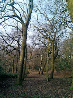
Before...
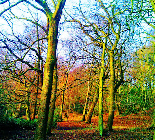
After...

This picture was taken in Corporation Park, Blackburn, as it was the ideal location for tree scenery. The original picture was dull and didn't seem very interesting to use as a digipak panel. In order to make it interesting I needed to edit it. I used PhotoShop to help me achieve a colourful and vibrant panel.
Firstly, I needed to edit the brightness and contrast by 20% each. I change the saturation by 85% and altered the hue to green, which made it to a wintery feel. After this I changed the contrast again by 12% to get the black shadows to stand out. Smart blur helped the image look more softer as it started to look really sharp as if it was cut out. Thats basically all, it links in well with the rest of the digipak as it represents the seasonal weather. It also represents the warmth of the lyrics.